
The subject of User Experience should be of interest to anybody who cares about optimizing the traffic on the website. Taking care of users’ experience during using your website works positively for conversion, so e.g. the purchase, newsletter signup, sharing the content or sending an offer request.
Below, we list 10 universal UX rules that you need to take into account while designing your website.
1.Include mobile devices when you design
The data gathered by Google leave no doubt: 58% Polish Internet users browse the Net on smartphones as much as on computers and laptops, and 26% choose the smaller screens more than the big ones (data from Google Consumer Barometer). In Western Europe and the USA, the percentage of users who prefer mobile devices is even higher: in the States it is 35%, in Great Britain 32%, and in Germany and France it’s respectively 33% and 34%, while in countries such as India and China it is as much as ¾ of all Internet users.
That’s why taking care of UX on mobile devices should constitute an important part of design work on the website. Adjusting it to needs of both desktop users and smartphone owners isn’t a “good practice” anymore – it is now simply necessary.
Google recommends and supports three solutions in this area:
- elastic website design (i.e. creating responsive websites) – websites automatically adjust to the size of the screen and the type of device. It is a simple and efficient solution, ideal for the majority of website owners.
- dynamic display of content – it is a solution that presents a different type of content depending on the kind of device on the client’s side. It is recommended for companies that cannot give up on the quality of content displayed on a desktop to make the content on mobile display faster.
- separate URL addresses – the website in its mobile version is on a different address than the desktop version. Visiting on a smartphone redirects to the mobile website. It is recommended in situations when we want to use a different technology for building the mobile and desktop websites.
2. Simplify the information architecture
The so-called “three clicks rule” means that each subpage of your website should be at most within three clicks from the main page, i.e. it should be available at furthest from the category subpage or subcategory. Thanks to that, the user will easily find the content that they can’t find using the search bar on your website. It is especially important for e-shops, where users often look for products based on e.g. application, not names.
Simplifying the information architecture also means creating a transparent and intuitive sitemap. It is necessary to take care of the comfort of moving on the website: e.g. pagination in articles (most often used to increase the number of ad views) will work only with a very well optimized code of the website. Otherwise, the time of loading another subpage may be too long. It is a very well-known problem; even very popular websites like e.g. Yahoo! have been criticized for such practices.
3. Do not use functions that make it harder to navigate
Pop-ups jumping at you, buttons and links that can’t be distinguished on the site’s background – all these solutions significantly lower the comfort of using the website. In particular the former – pop-up ads windows – are especially annoying. There are far better ways to convince users to sign up for a newsletter or make a purchase; the best ones are based on providing an added value (e.g. “Sign up for our newsletter and download a free e-book or report”).
4. Optimize searching inside the website
Improvements that can make it a better experience for users are e.g. auto-filling, limiting the initial result list to the most popular products, search functions inside the website, ability to add a product to your cart from the list of products, and also recognizing errors in searching (so that the user won’t have to correct typos or re-enter their query). Because of more and more websites using these solutions, the search optimization within the website is becoming a standard and the lack of it may be a serious drawback.
It’s worth noticing here that all these functions turn out to be particularly important for mobile devices. A smartphone user will surely appreciate the auto-fill function while searching for a given product; adding the product to the cart from the search result list can also be a similar advantage, especially on slower networks. Error recognition in spelling is now pretty much a standard – this function has been implemented in all the biggest e-shops and e-commerce platforms in the world (Amazon, eBay, Alibaba, and even Allegro); smaller websites use it too (e.g. Zalando).
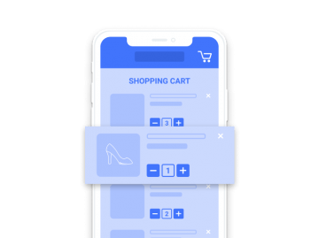
5. Simplify the checkout
Carts getting abandoned at the checkout stage are a problem for many an e-shop owner. In most cases, however, it’s enough to adequately design the whole process – it will save you money later that you’d spend on remarketing, texts about a “sad cart”, or mailings harassing the users. It’s best to apply these rules:
- minimization of fields in the form – require the user to provide only the data that you need to carry out the contract;
- breaking the form into more pages if there are a lot of data – in this situation, it’s good to inform the user about the exact number of steps that they need to take (e.g. with a graphic showing the next steps at the top of the page);
- supporting various payment methods – it’s a key feature. If after filling out all the necessary fields the user finds out that they can’t pay in the way they prefer, chances are that they won’t accept another;
- automatic filling of forms for registered users – but with the option to edit (if the user would like to change the address for delivery).
You’ll find detailed information about How to design a better shopping process on mobile devices? in our article.
6. Take care of proper deployment of text on the website
Eye-tracking research indicates that while reading websites, users mainly keep to the top-left part of the site; the heatmap of the areas that they look at falls into a distinctive “F” letter shape. Many website designers use these conclusions in the simplest way possible: by putting social media widgets, and even offer elements in these areas.
Deployment of text (and all elements, generally) on the website should also be conditioned by your own analysis. It’s a good idea to check regularly how the users move on the website; this will help you check if the design based on earlier assumptions helps you execute your business goals. A few efficient tools come to mind, e.g. the popular Hotjar, Crazy Egg, Kissmetrics, or Smartlook. They let you verify how the users interact with the website. The results of studies carried out with them are a great help for statistical data (obtained e.g. with Google Analytics, Adobe Analytics, Piwik) and make it easier to decide on the direction of possible changes on the website.
7. Enable registration, but don’t make it obligatory
Research conducted by Baymard Institute in 2017 indicates that requiring users to register in order to finish the order contributes to 37% of all cart abandoning. Only not transparent or jacked up costs are higher.
Benefits connected with registration should be an encouragement, not a necessity. Requiring registration from the start blocks you from reaching the users that don’t want to do it.
8. Take care of the website’s loading speed
Finding a reasonable resultant between good appearance and the loading speed is not a big problem now: the newest web-dev technologies make it possible to reconcile these two interests. Selection of appropriate technological solutions should take place at the design stage of the website.
The loading speed is still a problem for the mobile platforms, though. In the case of mobile, we primarily recommend removing unnecessary functions, e.g. sliders or post carousels, shortening the list of the so-called critical resources (i.e. essential to display the website) and applying advanced compression techniques. A Google tool Test Your Mobile Website Speed and Performance comes in handy in studying the loading speed. It helps you verify how much time it will take to fully load the website on mobile and generate a simple report about the most important problems. You can examine it more comprehensively for all resources downloaded from the server by programmer tools (in Google Chrome you get it with Ctrl+Shift+I)
9. Come up with a catchy Call To Action and place it in a visible place
Excluding the basic contrast principle – CTA must be visible among the rest of the content – there are no universal rules for the CTA button’s appearance and place for desktop. It’s worth testing a few options and pick the best one for your website – e.g. with the very popular A/B tests, testing at the same time one of the elements (e.g. only the color, only the place).
It’s far easier in the case of mobile. The rules here are primarily about the visibility: the CTA has to be visible from the start and inform straightforwardly what is expected from the user (at the same time – what the user can expect after tapping the button). The button must be easy to tap – small screens are way less precise than the big ones. The basic rule is simplicity: e.g. “Come in”, “See”, “Buy”, or “Learn more…”.
It’s also worth having in mind the difference between the contextual CTA and out-of-context one. The latter doesn’t require the user to know the content of the page; it’s all the “Buy now!”, or “Add to your cart” buttons. The content of contextual CTAs is on the hand dependent on the content of the website – it requires the knowledge of this content. It’s the “I agree”, “Do it”, or even simple “Yes”/”No” messages. When using them, you need to remember about their clarity and your users’ habits.
10. Inform the users about doing what they expect
A good example: if someone wants to add a product to their cart, they should first be informed about this action, e.g. by a short and non-intrusive animation or sound, or at least a small digit representing the number of selected products appearing next to the cart icon. Informing that the user has completed the desired action will let you avoid a situation in which they e.g. add the same product to the cart a few times (or they need to stop shopping to check if they’ve succeeded).
Summary
While designing a website, you should remember the goal which the users visit it for and the ways in which they do it (e.g. when buying in other e-shops). Benchmarking your competition is a very important element of the design work – you need to check carefully which solutions are getting popular and which are being abandoned. The majority of users is used to the fact that clicking on a logo in the top part of the page directs them to the main page of the website. It’s possible that there’ll be other solutions which we get used to.

You might also like

Increasing mobile app retention focuses on the users returning…
Most marketing and e-commerce experts agree that m-commerce applications…
The number of people shopping through mobile devices is…

There has been much talk of e-commerce in recent…

App Store Optimization, or ASO, entails the process of…