The number of people shopping through mobile devices is growing dramatically. According to Gemius, already 61% of web users buy through mobile devices. More and more companies decide not only to optimise their web page for mobiles, but to develop a mobile application, which provides many additional benefits both for the company and the client. One of the greatest challenges is to design an enjoyable, user-friendly application, allowing easy as pie navigation.
Here is a list of seven rules to help you reach those goals.
Rule of Thumb
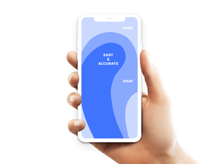
Designing an app we should remember to keep key functions within an easy reach, bearing in mind that most users hold mobile devices in their right hand operating with their right thumb. Also, what matters is that smartphones have become much larger recently. Properly placing your key buttons increases customer comfort, accelerates purchase flow and lessens frustration, which may arise with each futile attempt to reach far-spaced buttons. Mind this rule while designing an app interface and you can reduce users’ annoyance and facilitate button accessibility, which translates to an increase in click-through rate for your desired content.
Account at the Push of a Button
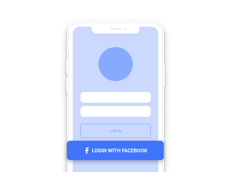
When creating a registration screen you should follow a few basic rules. First, make sure registration process is simple and takes but a moment. Ask only for information imperative to the registration process so as not to discourage users by the sheer amount of the required data. Instead, you can inform your users they will be able to supply the missing data later on, once the context is conducive, where there is a clear gain offered in return or the data is needed to proceed with a key process, e.g. a purchase. For instance, children’s age may be an additional piece of information worth asking for in a toy or clothing application once the registration process is complete. Users may search for desired items by means of various filtering tags, but should they decide to share that particular piece of information, the app will customise content so as to reduce the number of clicks required in a search for suitable products or special offers.
Also, make use of functionalities shared by the social media, especially the log-in-with option. Customers appreciate the opportunity to register via a single click, which facilitates the process and additionally helps save tame. Despite an ongoing discussion on the threats connected with sharing your data with a range of applications, users happily utilise the possibility to quickly create an account through an existing Facebook profile or a Google account.
Finally, it may be well worth considering to allow open browsing and purchasing options registration free. This alternative allows customers to get familiar with app functionalities no strings attached. Naturally, unregistered users gain restricted access only and are informed of functionalities available to them should they choose to register.
Product Search
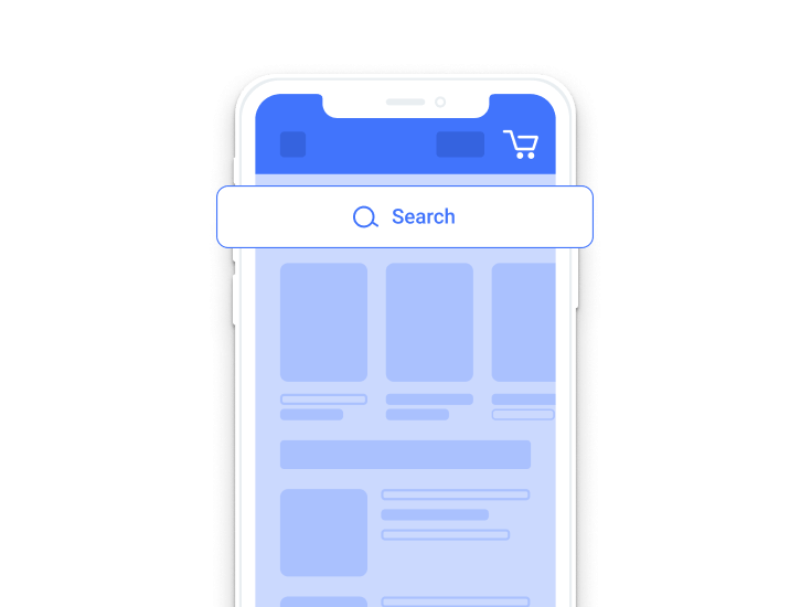
The main task of an e-commerce application is to sell products. To buy, though, customers must be able to find the desired products easily and quickly. Product search is also a key functionality in loyalty apps for the retail sector companies that sell only in brick-and-mortar stores as often customers decide whether or not to visit a given shop based on their online product search.
The simple search box should be centred top of the welcome screen. This guarantees visibility. Additionally, the box should offer autocomplete and top most popular search listings to significantly reduce input time.
Moreover, to ensure smooth product search, customers should also be able to access advanced search options like filtering and sorting. However, keep in mind that helpful as they might be in the initial search, accelerating the process, in the longer run they may distract users.
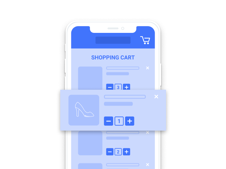
What about clients who have chosen desired products, but are reluctant to buy it at the moment? A must have functionality like ‘add to favourites’, ‘save for later’ or ‘save to wishlist’ come to the rescue. Commonly, the function consists of a separate screen where all products that a customer is interested in are placed, usually having been marked with a heart symbol. The application should store the favourite items until customers decides to remove them from their list. Additionally, such a functionality boosts the usefulness of the data on the percentage of discarded shopping carts. If customers have no means of adding a product to a wishlist, they often begin to utilise shopping carts in that manner, often adding products they desire, not necessarily being interested in purchasing them, which, in turn, skews purchase statistics and renders customers’ intentions unintelligible.
Furthermore, ensure transparency and simplicity for each search. Users looking for their desired items should be able to reach them within three clicks. One way to do it is to create tags, e.g. ‘long dresses’, ‘birthday gifts’ or ‘on a date’, or divide your items according to categories, subcategories and product types.
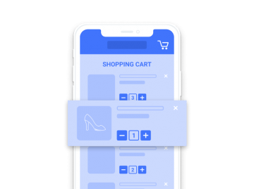
Superb Shopping Cart
Let us start with the add-to-cart button. Most importantly, the button should be conspicuous, easily differentiated against the background and not blend with the other buttons. This can be achieved by alterations in its size, screen placement, colour or transparency. Choosing the colours remember about the rules of colour psychology for design. Each colour evokes certain emotions, thus, a strategic approach towards the colour scheme may enhance your customers’ confidence in adding products to a shopping cart. Make sure that the colours you choose carry positive associations with safety, approval and trust. Many companies decide to use colours based on their visual identification systems, disregarding a variety of factors. The issue requires more insight than this entry allows, but we plan to publish a separate blog entry devoted solely to colour schemes soon.
With respect to its appearance, a screen wide add-to-cart button is a very good solution. When you take into the account that about 20% of users are left-handed, a screen wide button sets the perfect conditions for either left or right-handed customers to keep on adding items to the cart.
A shopping cart is a key element of every e-commerce application as it is the last touch point before moving on to payment. What does a well-developed shopping cart look like? It comprises a clear shopping summary, editable product amount box, a possibility to remove items from the shopping list, a box to enter special offer codes, total order cost and two essential buttons: ‘continue shopping’ and ‘proceed to checkout’. Naturally, depending on your business sector and the type of product you offer, you might want to add further elements and functionalities, such as present additional services rendered or suggest other complementary products. The former, however, remains the absolute minimum.
Easy-Peasy Payment Method
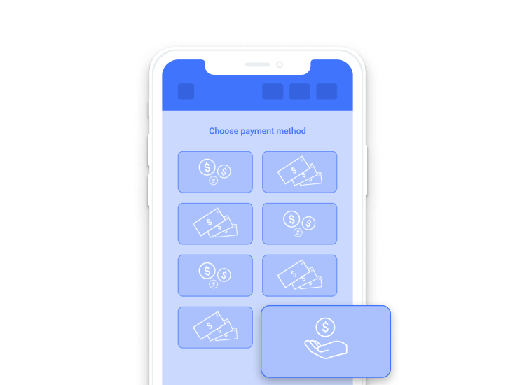
Research shows that payment is the most stressful part of the purchasing process. Often, customers abandon their carts if registration is required to complete the purchase. A well-developed app offers a guest mode, which ought to be a highly discernible functionality. Fearing no abandonment, you may encourage customers to register an account once payment has been made by means of a suitable notification or offering a tangible gain, e.g. ‘register now to get a 20 PLN off discount on you next order’.
Both for the logged in and unregistered users each stage in the payment process displayed on a progress bar, including the current stage, should be clearly visible. It is a recommended practice to inform users about errors present in their order forms. Rather than to look for an error and try to figure out what went wrong, users receive a message hinting at the field to be corrected.
Also, bear in mind that the app should offer a vast range of payment methods. You simply cannot afford to lose your customers at the final stage of the purchasing process, just as they are about to complete the transaction, because the app does not offer their preferred payment method.
Coherent Design
A well-designed m-commerce app should be neither complicated nor tortuous. The simpler the interface, the higher the likelihood that customers will quickly find what they are looking for. With the use of Material Design developed for Android or Human Interface Guidelines for iOS, let us create native applications which are intuitive and predictable, in the best understanding of the word.
There are three rules to keep here:
- proper colour scheme,
- unified font type across the entire design, where by far the safest solution is to use the system default fonts, i.e. San Francisco or iOS and Roboto/Noto for Android,
- sections made with the use of proper spacing and typography, which unlike other separators, e.g. graphic lines, provide a sense of novelty and require no extra space.
To keep the design coherent, make sure the app is made of recurrent elements and interactions. What that entangles is that once we decide to utilise, say, rounded buttons, which shade once clicked, they should appear and behave consistently across every single location within the application. Moreover, if a company launches the app for both Android and iOS, or additionally has own web page, these should all share an underlying principle of design.
UX Up Your App!
Attention to detail when it comes to appearance and performance are key to successfully set your application apart from others. Use of microinteractions might be just such a detail to help you spice up the interaction between the device and its user. Microinteractions are meant to enliven user experience, while simultaneously performing a specific task. They include among other such activities as liking or reviewing products, choosing size or colour schemes, or sliding down the screen to refresh it.
Due to their fluid and natural character microinteractions deepen users’ psychological comfort and make apps more user-friendly.
The other functionality which can make you application more attractive to users is the possibility to enlarge product pictures. According to research, applications which enable photo enlargement by means of a gesture, such as double click or pinch-to-zoom, record higher sales results. As customers often would like to learn product details prior to procurement this functionality warrants consideration during design phase. Should you wish to incorporate it in your application, make sure you supply high resolution pictures for the functionality to fully work. Additionally, it may be a good idea to include an icon meant to inform on the possibility to zoom in or out on a photo.
To sum up, when you design an app, make sure to:
- place valid information within the reach of your customer’s thumb,
- make user-friendly and quick-to-fill-in forms, e.g. registration forms,
- include a quick product search box, advanced filtering and sorting options to speed the process, and create a wishlist,
- design a clear and editable shopping cart, which allows to add items in an easy way,
- offer complete payment process registration free along with a variety of payment methods,
- unify your design,
- incorporate UX enhancing elements such as microinteractions or double click to enlarge photos.
In order to satisfy customers’ needs and ultimately to improve product sales, we should follow a set of rules,while designing an e-commerce application. This article describes but a few most important rules, and thus provides a jumping-off point for further exploration and, we hope, motivates to broaden your knowledge on user focused design. Keep in mind that humans and their needs ought to be the centre of any process of design. Stimulating positive associations is essential to turn shopping into an easy and pleasurable experience, which surely will be reflected in your company’s profits.

You might also like

Increasing mobile app retention focuses on the users returning…

Most marketing and e-commerce experts agree that m-commerce applications…
The number of people shopping through mobile devices is…

There has been much talk of e-commerce in recent…

App Store Optimization, or ASO, entails the process of…